
Field Notes ·
One mobile world across phones, foldables and tablets
Responsive game design preserves decisions and reachability while the screen, posture and input method change around the player.
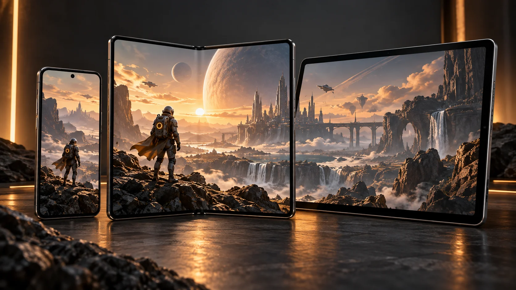
A mobile game does not live at one resolution. Phones rotate, foldables change posture during play, tablets invite longer sessions and external keyboards or controllers can appear at any time. A responsive game preserves the player’s state and intent while the available space changes.
Adapt the composition, not only the scale
Android Developers recommends planning for different form factors, interaction methods and hardware capabilities. On a wider screen, useful information can move beside the playfield instead of simply making every control larger. On a narrow screen, the same hierarchy can become a focused sequence without hiding the primary action.
Keep interaction native to the device
Apple’s games pathway emphasizes the characteristics of the device and its default interaction method. Touch remains central on iPhone and iPad, while optional controllers and other inputs can add flexibility. Supporting another input must not make the default one feel secondary.
A practical test matrix
- Resize and rotate without losing the current decision or save state.
- Test phone, short landscape, foldable transition and tablet layouts.
- Connect and disconnect optional input devices during a session.
- Verify that the primary action remains visible, reachable and unobscured.